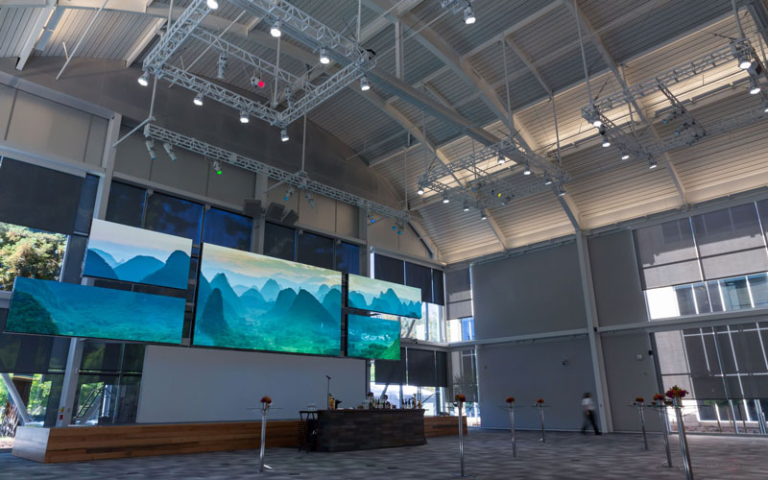
If you want to make your booth stand out from the crowd at the trade show, it’s important to have appealing displays because humans are visual creatures, and we remember what we see.
Based on our experience of working as Las Vegas rental booth builders and designing the best trade show booth displays for our clients, we have listed these factors that draw more crowds to your booth.
We have listed these factors below in the list, and you can keep them in mind while crafting your trade show display design.
8 Factors to Keep in Mind While Choosing Booth Displays for Trade Shows
1. Assess the Graphical Real Estate of Booth
The first thing that you should do while anticipating your trade show display design is to get an idea of how much space you have to execute your design idea.
The best way to navigate this complexity is by dividing your booth into zones for different purposes (e.g., product demos, information counters, meeting areas) and then designing a display for each.
You also need to make sure that the designs and graphics are in proportion to the booth size to avoid unnatural visual proportions.
By assessing the graphical real estate, you can use your booth space effectively while making sure that all critical elements are visible and accessible for maximized engagement.
2. Keep it Simple and Irresistible
After you have assessed the space for graphics, the first factor that you need to keep in mind while designing your trade show booth display is its simplicity. Minimalism and subtleness are the new trends, and they work here, too.
A trade show booth display that has too much information represented in a cluttered way passes an unprofessional image of the brand. Not only that, but it also makes your visitors feel overwhelmed and confused, making them avoid looking at your display at all.
So make sure you craft a booth design that’s simple, subtle, and clutter-free.
3. Use the Right Colors
Colors play a major role in grabbing attention from your target audience at the trade show. They also influence how a visitor perceives your brand, so it’s very important to choose the colors that convey your brand’s voice and attract the right audience for your booth.
It’s highly recommended to stick to your brand colors to increase brand recalling opportunities. In addition to that, you can also choose to use colors that evoke a desirable emotional response.
For example, you can use blue to convey trust and professionalism, while red can evoke excitement and urgency.
4. Use Creative Visuals
Another factor that influences the effectiveness of trade show display design is the creativity of visuals. Don’t limit your visual range to statistics only. You can add animations and videos to the wall display to grab the attention of the audience amidst a pool of similar designs.
Additionally, it’s recommended to use professional, high-resolution graphics that are clear and visible even from a distance. Remember to incorporate storytelling elements to make a great impact.
5. Highlight Your Messaging
Your brand message on the trade show display design can be a great way for the sales team to start conversations with visitors. As these displays can be placed high on the booth, it’s important to ensure that the font size is big enough for the reader to see it clearly, even from a distance.
Craft your brand message in a way that showcases exciting benefits rather than usual features. Moreover, use a consistent and legible font style and size to maintain brand consistency.
Lastly, you can also create a memorable tagline specifically for the trade show to stand out from the crowd and capture the heart of your audience.
6. Keep Empty and Negative Space
Do you know what can make your display one of the best trade show booth displays? It’s empty and negative space in your designs, which prevents the booth from looking cluttered and helps important elements stand out.
You can ensure empty and negative space in your designs by strategically placing adequate spacing around elements and not filling every inch of your display. Hiring a professional designer for these trade show designs is also a good way to leverage design concepts in your displays.
7. Have Proper Formatting and Resolution of Images
When you craft trade show booth displays with proper formatting and high-resolution images, it provides an extra layer of professional appearance and enhanced visual appeal to your design.
It’s recommended to use images with a resolution of at least 300 DPI for print materials to avoid pixelation. Plus, make sure that all images follow consistent aspect ratios to avoid distortion.
And if you feel like editing an image for trade show purposes, it’s always recommended to use professional editing tools to maintain image quality and consistency.
8. Highlight Your Brand
While designing your trade show booth display, other than all the pointers mentioned above, it’s recommended to highlight the brand by placing your logo prominently on the booth, ensuring it is visible from a distance.
Plus, whatever images, videos, animation, and elements you use, ensure they align with your brand vision and mission. Even in the giveaways that you offer, there should be branding elements to increase brand awareness.
➔ Are You Ready to Design the Best Trade Show Booth Displays?
We hope all the information that we have provided in this article has given you a good idea of how you can effectively craft your displays at trade shows.
You can share this with your fellow exhibitors and your team members to collaborate together for your next trade show.

Daniel J. Morgan is the founder of Invidiata Magazine, a premier publication showcasing luxury living, arts, and culture. With a passion for excellence, Daniel has established the magazine as a beacon of sophistication and refinement, captivating discerning audiences worldwide.


